
OVERVIEW
Hollarhype is a voice-based, real-time communication app that can be downloaded onto your phone. The goal of the hollarhype is to provide motivation and connection during the times it is needed the most.
Our task was to refine the on-boarding process for individuals training for events and their supporters, making it as simple and accessible as possible in order to increase the number of registrants and active members on hollarhype.
Myself, along with two other designers were the main designers working on this onboarding revamp in Spring 2020.
Client: hollarhype
My Role: User Interviews, Competitive Analysis, Sketching, Usability Testing
Timeline: 3 Weeks
Type: Client Project
Fidelity: High-Fi
GOALS
On Boarding Revamp
User Goals: Easy sign up process
Business Goals: Increase app adoption and engagement rates
Sharing Feature Addition
User Goals: Ability to quickly share the app with their supporters
Business Goals: Increase app adoption and engagement rates
RESEARCH
In order to fully understand what changes needed to be made to the onboarding and sharing flows, we conducted 1:1 interviews and baseline usability tests to identify current pain points - our focus for these three weeks.
Users did not realize what information was required or optional in the account creation process (phone, email, picture, name)
The original on-boarding information screens were confusing and not helpful. Users were left wondering what were the next steps.
Users did not want to be forced to take/upload a photo of themselves.
Based on this research, we found three redesign focus points. We performed four rounds of design iterations based on feedback from usability tests.
What were they saying?
“The learning curve is steep…for an app that has one function it seems very odd…”
— UX Research Participant
“I don’t like that {required photo} at all - I don’t have my photo anywhere”
— UX Research Participant
How could we address these main pain points that our users were experiencing?
Let’s take it to the drawing board - quite literally.
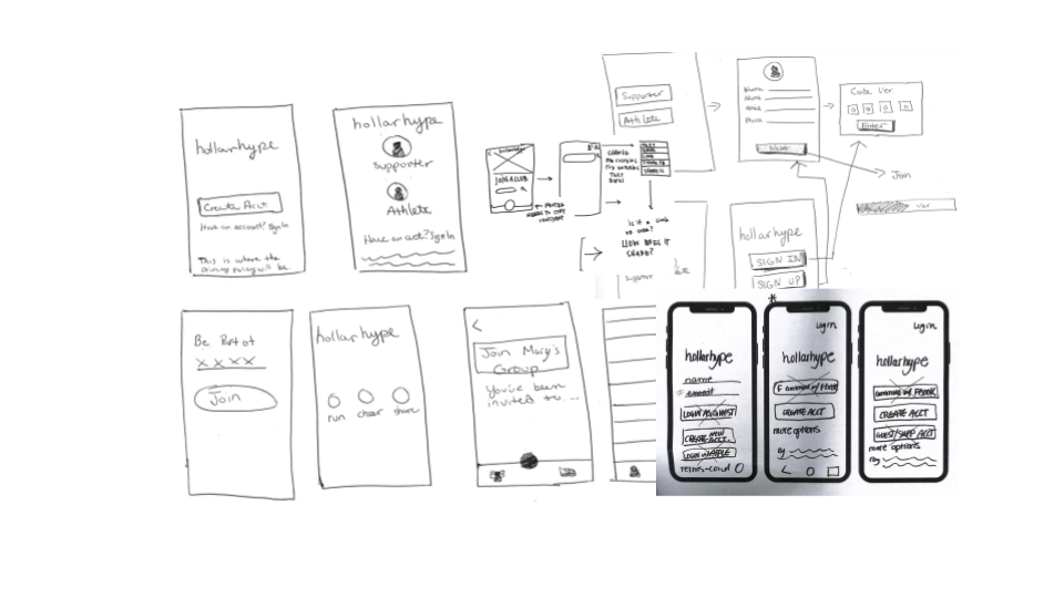
We conducted multiple design studios to brainstorm some concepts and work through them as a team.
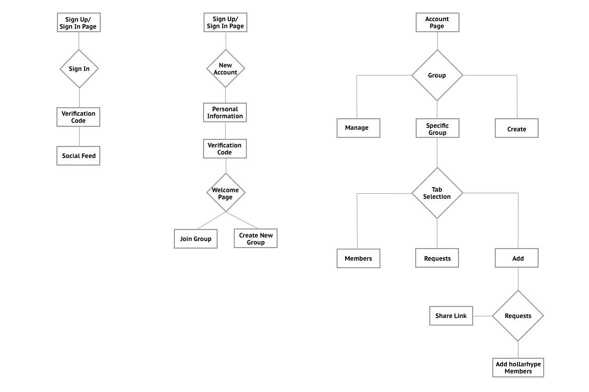
After brainstorming and solidifying an idea from the design studio we came up with three user flows to focus on designing.
We needed to ensure these flows were being addressed:
1) Account Creation 2) Account Sign In 3) Sharing Group Link
Now that we had user flows sketched out and agreed on a design, we wanted to get feedback from the users to confirm if we were going in the right direction.
A paper prototype was created which helped us to validate some our original design concepts specifically addressing the users main pain points. We decided to use Marvel Pop instead of the paper sketches. This allowed us to give a more realistic experience for the participants of our usability tests.
After performing usability testing on the paper prototype and validating that users were able to successfully the sign up, we began digitizing the wireframes in Sketch.
REDESIGNS
Sign In / Sign Up
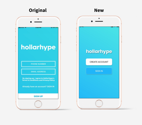
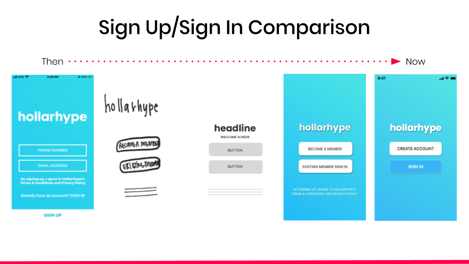
Problem: Users did not realize what information was required or optional in the account creation process (phone, email, picture, name)
Solution: We found through our usability testing that the wording was not cohesive with the style guide and we went from becoming a member to creating an account.
In addition, the initial screen with the email and phone number had no correlation to the sign in link at the bottom of the page. The proximity on the first page was the problem and users were not aware that they were form fields and not buttons.
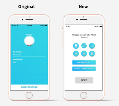
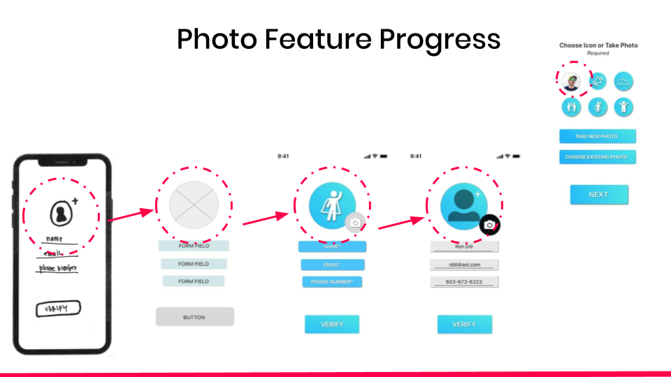
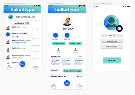
Profile Photo
Problem: Users did not want to be forced to take/upload a photo of themselves.
Solution: From our research and the pain points of users, the Choose Icon option was created. It is a new page in the on-boarding process that forces the users to know they have to upload a photo but also allows them to choose an icon if they prefer not to.
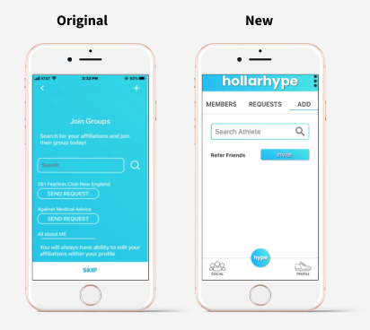
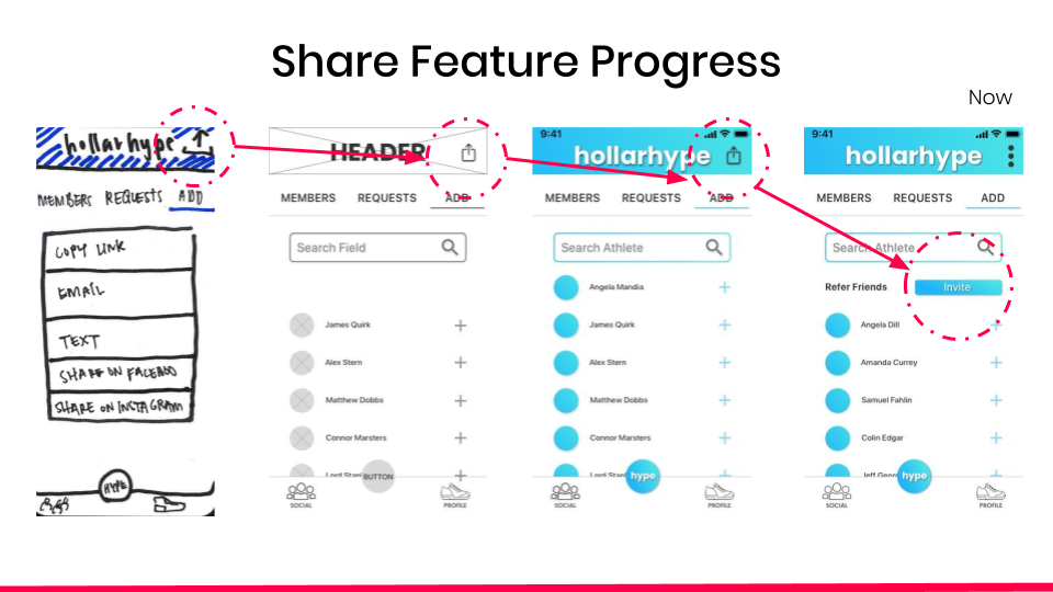
Sharing Symbol
Problem: In our original designs, we used the common symbol for sharing/uploading. Unfortunately, the majority of users did not even notice the symbol. This meant we needed to go back to the drawing board.
Solution: After several iterations with this issue we choose to create a CTA button that simply says ‘INVITE’ to prompt users to send a link and refer family/friends.
Want to see the progress of those designs from start to finish? Check out the gallery below…
Results
After presenting our designs to the founder, we received very positive feedback on the redesign, and we were also able to provide some additional recommendations for future design updates. By completing this project, we are helping hollarhype to increase the use of the mobile application and increase membership rates due to the decreased friction in the sign up process.
This MVP design was then passed off to the founder’s main coder for implementation.
Try the app out yourself!
What’s Next?
No design is every truly complete. There are several recommendations we proposed to the founder of hollarhype with regards to next iterations.
Update style guide to include colors that are accessible
Allow for a third party sign in feature
Contract for more UX writing for the overall app
Example of hollarhype with accessible color palette