
OVERVIEW
The Boston National Historical Park Service is home to over 3 million visitors yearly and is composed of 16 historical sites along a 2.5 mile trail through historic Boston.
The goal of the National Park Service is to preserve the “unimpaired the natural and cultural resources and values of the National Park System for the enjoyment, education, and inspiration of this and future generations.”
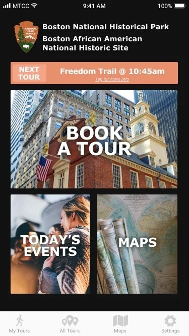
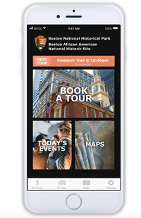
Our team of four was tasked with adding a feature to the Boston National Park Service iOS mobile application that allows significant flexibility for groups to book tours on the Freedom trail.
Client: NHPS
My Role: User Interviews, Competitive Analysis, Sketching, Usability Testing
Timeline: 2 Weeks
Type: Conceptual Mockup
Fidelity: High-Fi
User Research
6
In-depth Interviews
4
Competitive Analysis Studies
2
Proto-Personas
4
Days
In order to build more context around how to best assemble this application, we wanted to gather firsthand feedback from users of tour booking websites/applications.
The research process included many steps such as in-depth interviews, competitive analysis, online review analysis, and data analysis based on NPS statistics.
While conducting user interviews, I was able to gather some very valuable feedback which we then analyzed through affinity mapping.
What People Are Saying?
“What I would like to know about a specific tour would be the timeline of the tour with the costs of the tour... I don't want to pay an arm and a leg, especially because I may or may not like it.”
— UX Research Participant
“I would want to be able to pick the day and time easier in a format that works better on my phone, because I'm not bringing my laptop with me to bust open. And secondly, it would be the ability to get on a tour the same day.”
— UX Research Participant
Affinity Map
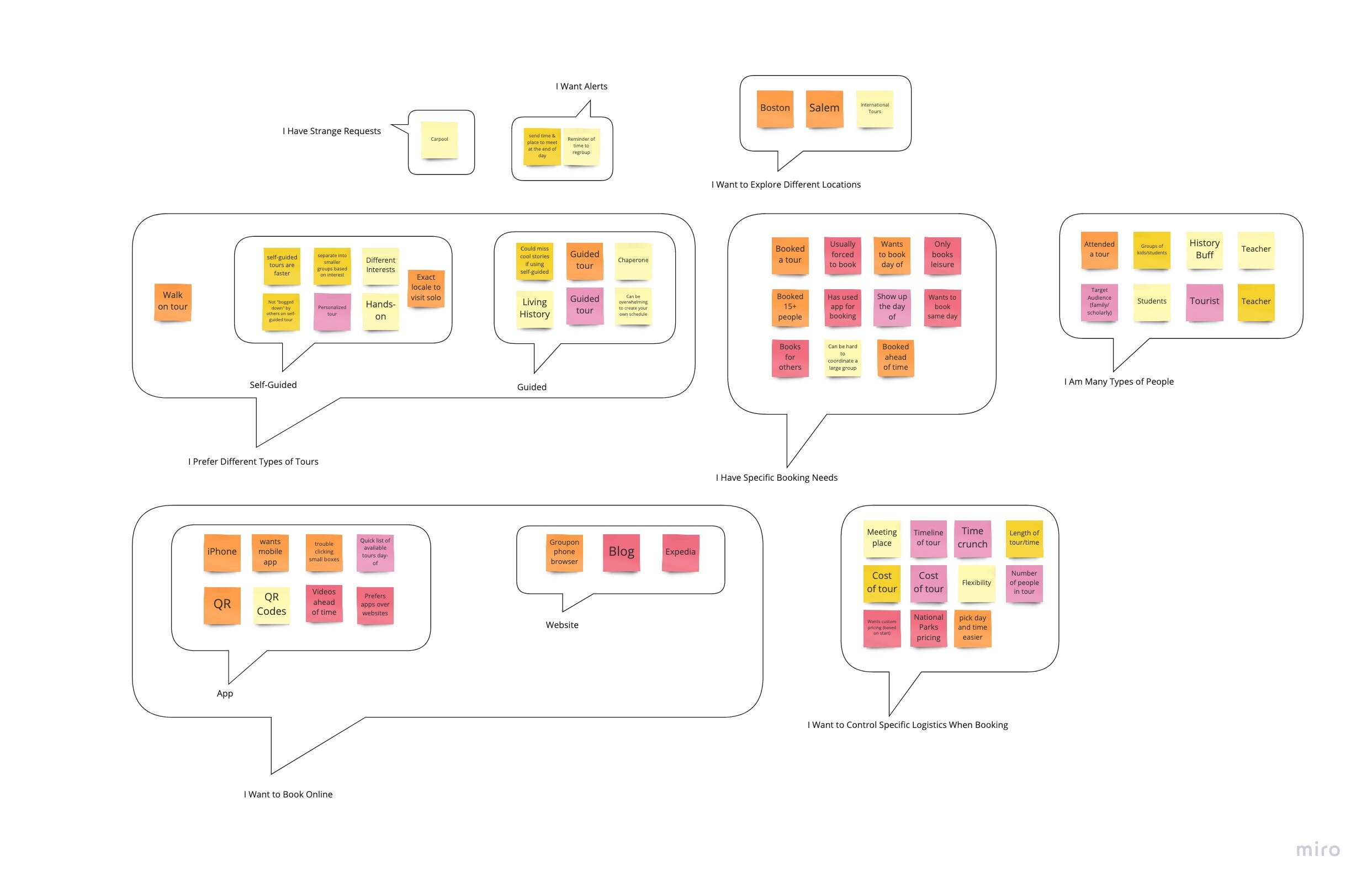
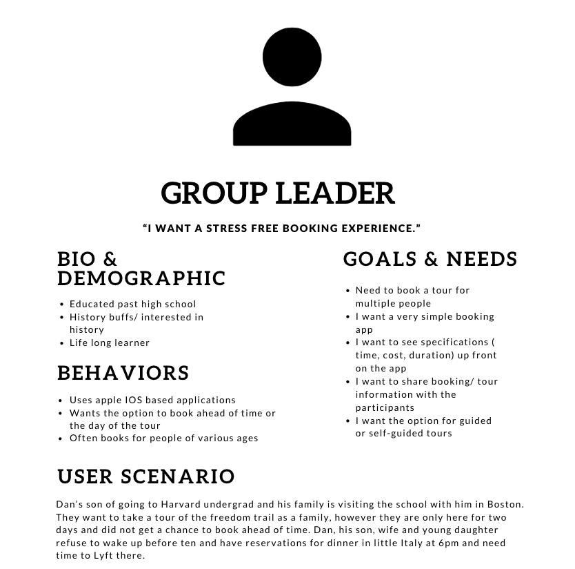
After synthesizing the information via affinity mapping, we were able to identify one main persona with which to reference during the design process.
Proto Persona
KEY RESEARCH TAKEAWAYS
1
Users are unique and they want to filter based on various booking needs such as tour duration, price, time, and sites.
2
Users prefer different types of tours (guided vs self-guided) and based on their experiences were vocal about their likes and dislikes of both options.
Design Process
In the first stages of the design process, our team participated in three design studios to gather as many ideas as possible and iterate on those various sketches. The design studio process allowed us to go through many different concepts (good and bad) and integrate those into a viable design solution.
The first prototype was created via sketches on paper. I took this version to several users to get feedback and made corresponding modifications.
After creating a wireframe in Sketch, we performed additional usability testing on the updated iteration.
Once a viable design solution was agreed upon, the visual design team started on the digital wireframes.
Throughout this process, all members of the team were constantly communicating in order to ensure we were keeping our users in mind through every step of the way.
Here’s an example of the stages of the home page design process:
Sketching
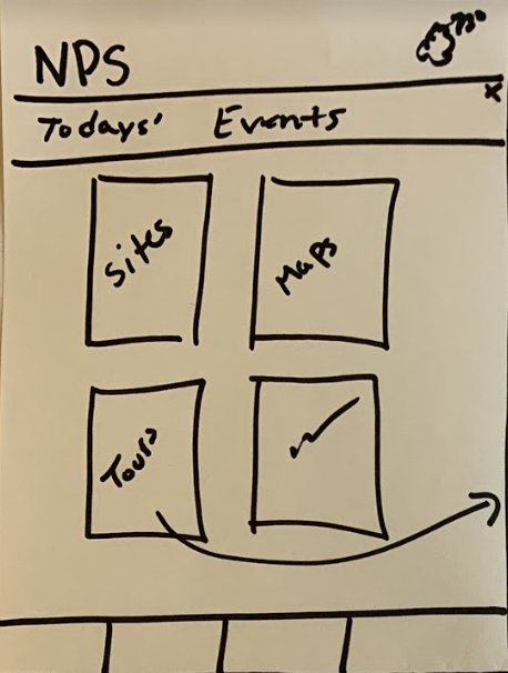
Low-Fi
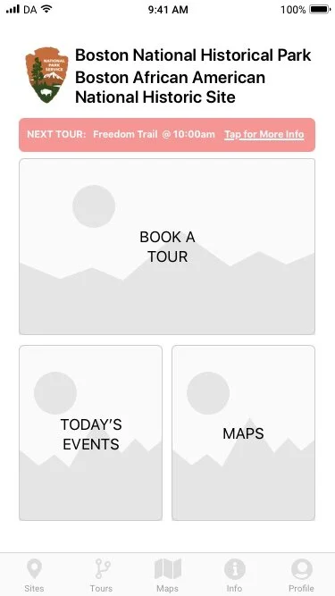
High-Fi
Usability Testing
In order to determine if our mobile application was user friendly, we took it to the masses and had various individuals test the application and provide feedback.
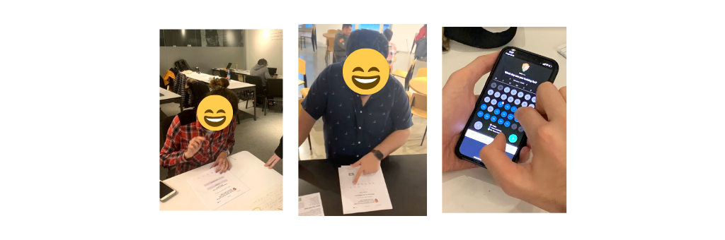
The results of our continued usability testing created valuable insight which we added into our design. Here are a few that stood out:
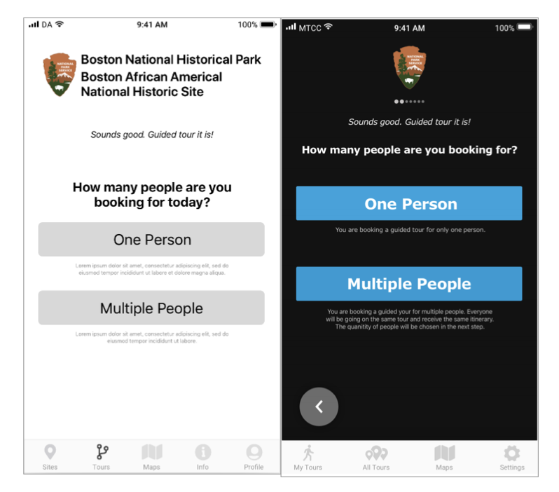
Problem: The wording on the application was confusing at times. At one point we listed the phrase “How many people are you booking for today?” this confused several users as they were booking for this tour in advice. This wording made them think they were booking a tour for that day.
Solution: The wording was updated to “How many people are you booking for?” - a simple yet effective update.
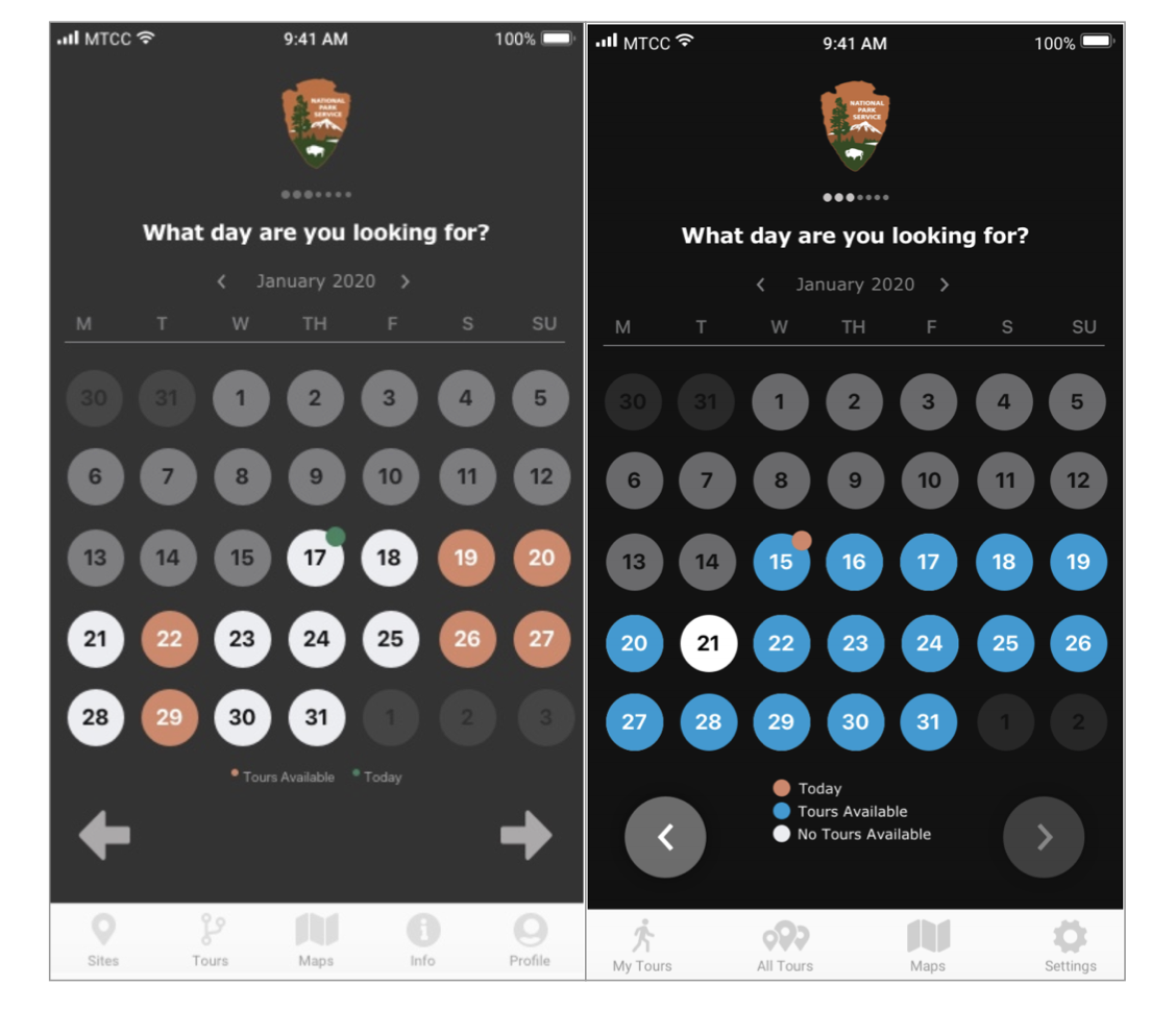
Problem: A user appeared slightly confused when presented the calendar with the orange indicating availability of tours on a given day. The user though that this meant that it was NOT available since it was close to the color red which is commonly used to indicate ‘stop & non-availability.’
Solution: The colors on the schedules were updated to blue (tours available), white (no tours available), and grey (past tours).
This process was a great challenge, and we were able to create a high-fi prototype that solved the initial request of creating an easy way for groups to select a tour based on their specific needs.
What are some things I learned from this experience?
I learned that performing usability testing throughout the process is invaluable!
Never underestimate the power of listening to your users!
Are you interested in trying the app out yourself?