
Tufts Health Plan
Client
Tufts Health Plan
My Role
Competitive Analysis, Card Sort, Sketching, Usability Testing
Timeline
3 Months
Type
Client Project
Fidelity
High-Fi
Helping Tufts Health Plan members understand their health insurance plans.
Tufts Health Plan is a New England based health insurance company with 1 million members. The company aims to provide high quality service and a variety of health insurance plans to meet various needs.
During my 3 month internship, my challenge was to redesign the navigation menu of the member website portal to provide an easier way for members to find information and to merge the design / setup of the mobile application.
The outcome of the redesign was that members (both new and old) could used the navigation menu and homepage and feel more in control of their plan and access to information when and where they needed it.
DESIGN CHALLENGE
How might we help Tufts Health Plan members understand what their plan has to offer quickly and easily?
SOLUTION
Create a navigation menu that is intuitive and allows members to quickly access information they are searching for within their accounts.
By creating a homepage that reflects the needs of THP members, the benefits will be twofold: 1) it will decrease the amount of time members spend searching for information and 2) decrease in the amount of customer service call that reps will need to take
User Research
15
In-depth Interviews
10
Remote User Surveys
12
Usability Tests
7
Days
Baseline Usability Study
The main goal of our baseline usability study was to determine areas for improvement in the design and
experience for members using the Tufts Health Plan website and mobile app.
In order to assess the current usability of these digital platforms, we performed usability tests asking
participants to a) explain what they believed would be found under each of the main navigation menu
items and b) complete the provided navigation tasks.
The hypothesis is that if we can be sure members can easily access and find information they are
looking for, this will help decrease the number of customer service calls and increase the overall
experience members have with THP products.
These ten unmoderated remote usability studies were conducted through Usertesting.com – 5 for the
website and 5 for the mobile app.
All participants were asked to perform the same tasks and brought back to the homepage after
completing each task in order to ensure consistency throughout the study.
As a first task, we asked each participant to say what information they believed was located within each
section of the main menu in order to help determine if the menu would provide the information as
expected to the participants.
Below are comparisons between the current navigation menus (website & app) and what participants
voiced they would have expected to find.
What People Are Saying?
“The learning curve is steep…for an app that has one function it seems very odd…”
— UX Research Participant
“I don’t like that {required photo} at all - I don’t have my photo anywhere”
— UX Research Participant
After synthesizing the information by consolidating the major pain points and looking at the current personas that were provided to us, we created two proto-personas to keep in mind throughout our designing process.
Key Research Takeaways
1
Users did not realize what information was required or optional in the account creation process (phone, email, picture, name)
2
The original on-boarding information screens were confusing and not helpful. Users were left wondering what were the next steps.
3
Users did not want to be forced to take/upload a photo of themselves.
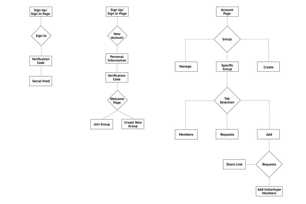
Design & Validation
How could we address these main pain points that our users were experiencing?
Let’s take it to the drawing board - quite literally.
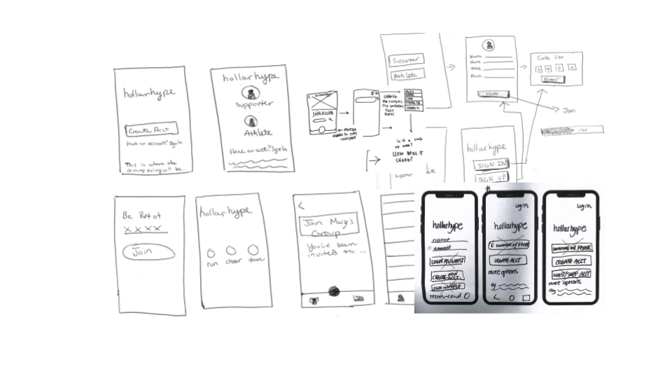
We conducted multiple design studios to brainstorm some concepts and work through them as a team.
After brainstorming and solidifying an idea from the design studio we came up with three user flows to focus on designing.
We needed to ensure these flows were being addressed:
1) Account Creation 2) Account Sign In 3) Sharing Group Link
Now that we had user flows sketched out and agreed on a design, we wanted to get feedback from the users to confirm if we were going in the right direction.
A paper prototype was created which helped us to validate some our original design concepts specifically addressing the users main pain points. We decided to use Marvel Pop instead of the paper sketches. This allowed us to give a more realistic experience for the participants of our usability tests.
After performing usability testing on the paper prototype and validating that users were able to successfully the sign up, we began digitizing the wireframes in Sketch.
We intentionally kept users involved via usability testing -
5 rounds of usability tests, totaling 41 overall.
Let’s take a look at some of the features that went through many iterations.
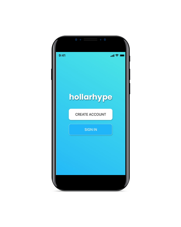
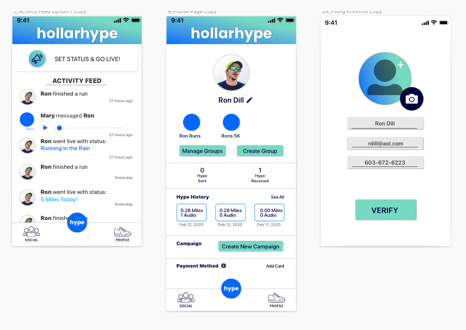
1. Sign In / Sign Up
The signup page was a problem area for most of our participants. The majority of users were confused and frustrated about those first three pages of content. The team decided to simplify and go directly into the welcome screen, either as a new or existing user.
We found through our usability testing that the wording was not cohesive with the style guide and we went from becoming a member to creating an account.
In addition, the initial screen with the email and phone number had no correlation to the sign in link at the bottom of the page. The proximity on the first page was the problem and users were not aware that they were form fields and not buttons.
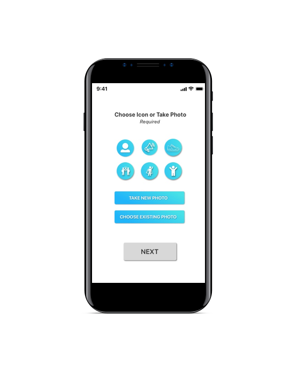
2. Profile Photo
Another field that users were skimming over was the mandatory upload of a picture for their profile. Throughout all our usability testing we discovered that majority of users were frustrated that they had to upload a photo.
From our research and the pain points of users, the Choose Icon option was created. It is a new page in the on-boarding process that forces the users to know they have to upload a photo but also allowing them to choose an icon if they prefer not to.
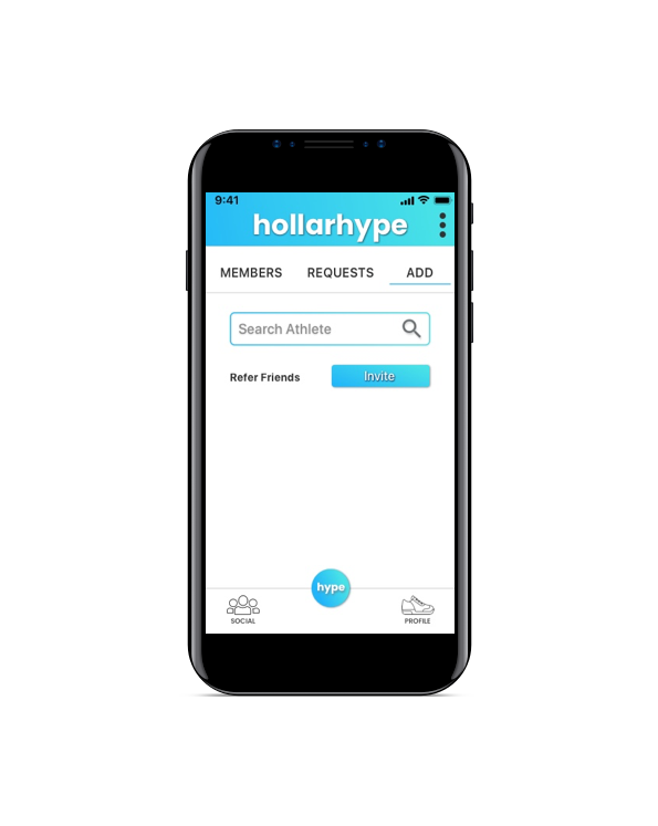
3. Sharing Symbol
How can we design the share feature in a way that users will easily find, identify, and recognize this feature?
In our original designs, we used the common symbol for sharing/uploading. Unfortunately, the majority of users did not even notice the symbol. This meant we needed to go back to the drawing board.
After several iterations with this issue we choose to create a CTA button that simply says ‘INVITE’ to prompt users to send a link and refer family/friends.
What’s Next?
There are several recommendations we proposed to the founder of hollarhype with regards to next iterations.
Update style guide to include colors that are accessible
Allow for a third party sign in feature
Contract for more UX writing for the overall app
Example of hollarhype with accessible color palette